 Phenquestions
To remedy this situation, let's look at a color picker that you can install as a plugin to Atom Text Editor making the entire process much smoother. You need to have Atom installed on your system. Once you have that installed, you can install this particular package on top of it. It has more than 1.7 million downloads and that makes it stand out, if you do decide to search via Atom Editor itself.
Installing Color Picker
Open up the Settings [CTRL + ,] in your Atom Editor, and in the Install section search for new packages.
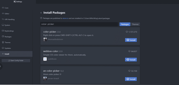
Install the color-picker (version 2.3.0 or later) and once it is installed, remember to Enable it.
Once all of it is done. You can go ahead and open a new text file and we can start testing it.
Various Color Picking Options
Open up a new file inside Atom, and with it open use the keybinding [CTRL+ALT+C] if you are on Windows or Linux or use [CMD+SHIFT+C] if you use Mac OSX.
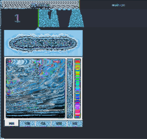
You will see a number of sliders and different bars on the right. The one on right most is to select the color left to it is the bar which determines the opacity of your color and the square in the middle decides what shade of a given color will be selected.
You can go extremely light shade which would look white no matter what the initial choice of your color was or you can pick a completely greyed out version of it or black. The normal use case involves picking something in between which fits your use case.
For example, people use different colors for the same element to make the site feel a bit more interactive. The hyperlinks can be assigned color blue and when you hover your mouse over it, the color changes to black.
Opacity is yet another important factor that developers use to hide elements underneath a colored patch, and when the user performs a certain action, the opacity goes to zero and the element underneath is made visible.
Different Standards
You will notice that the colors can be shown in different standards, most notably in RGB (Red Green and Blue), HEX and HSL formats.
Let's start with HEX format, since it is used quite a bit, at least at the beginner's level.
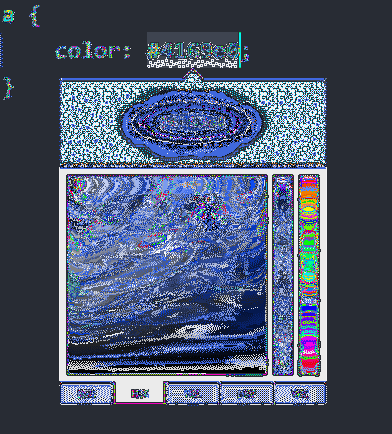
It is simply a hexadecimal digit (which is a numbering system that goes from 0 to 9 and then has a represent 10, b represent 11 and so on, till 15 which is represented using f). Pick a color using the color picker package, click on the HEX button below the widget and you will see that the corresponding hex code for that color is pasted in your editor.
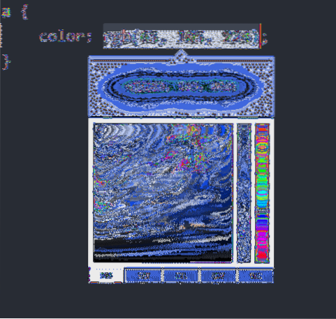
The next standard uses RGB which shows what percent of a color is Red, what percent is Green and how much is Blue.
The same color as above has the RGB representation as follows
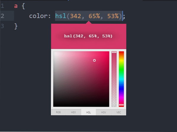
Lastly, you need to know about HSL which stands for Hue, Saturation and Lightness.
Hue represents what color does the element have. It could range from red end of the spectrum all the way to blue and it simply ignores the colors as combinations of red, green and blue (at least from the developer's standpoint). This is often described as a color wheel with red, green and blue 60 degrees apart from one another, but color picker had opened it up to a single bar on the right.

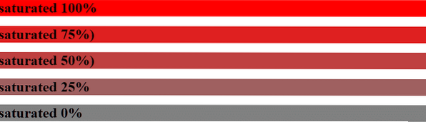
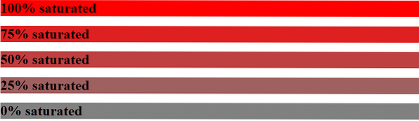
The next thing to worry about is saturation, which describes how intense the color is going to be. Completely saturated colors have no shades of grey, 50% saturated are lighter colors and 0% ones are indistinguishable from grey. The square space is perfect for selecting this.
Lightness describes how bright the colors are going to appear. 100% light colors are indistinguishable from white and 0% ones appear completely black. For example, if your site has a lot of reading material in it, you would want a less bright solution to make it easier for reader to engage. So that's HSL.
Conclusion
Editors like Atom and Visual Studio code have an entire ethos of useful packages and themes built around them. Color picker is but one example that a developer can use to forgo unnecessary trips to W3Schools or Stack Overflow. Using color picker still requires you to have a color accurate display which is properly calibrated.
Once you have decided the color palette for your project, however, you can start building projects faster and smoother using packages like Color picker.